 Stock Market Investing
Equities in 2026: Our Read on the Current Window
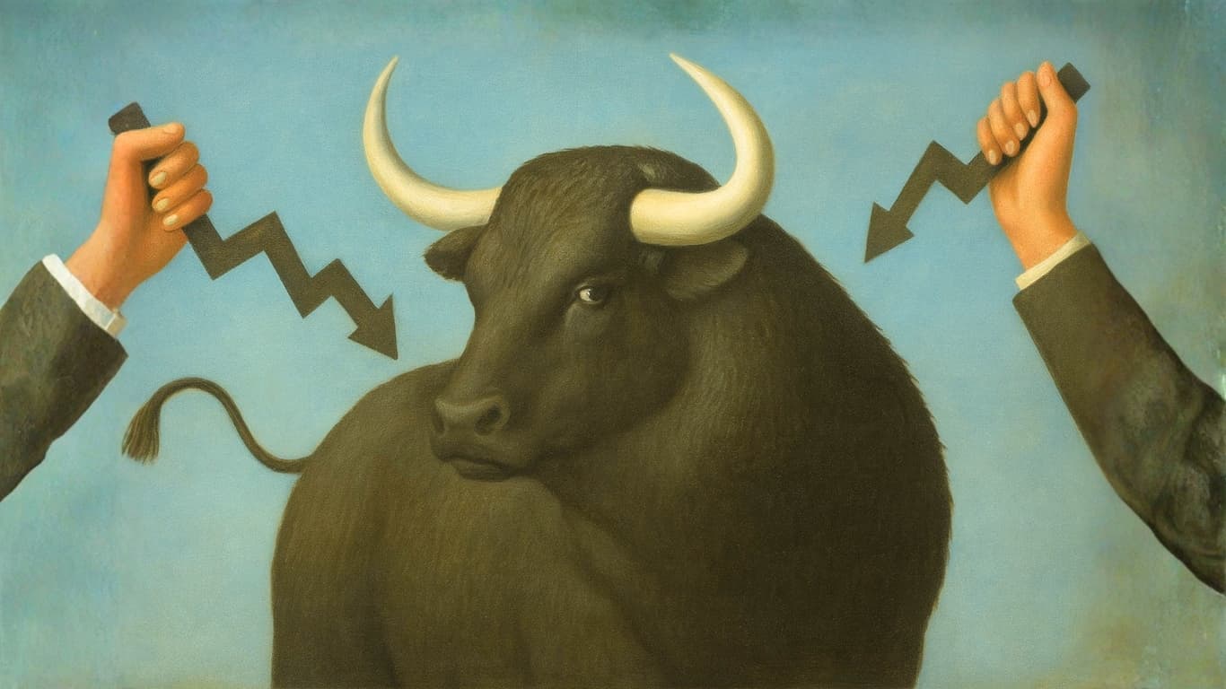
Most investors wait for certainty before buying stocks. That certainty never arrives. Research consistently shows that the ten best single trading days in any given decade account for the majority…